Top 25 Album Gimmicks
Welcome back to Top “Ten” Tuesday. This list is a follow-up list from what I talked about last time. Last time I gave a Top 40 list of the best album covers. Some album covers I didn’t want to include because they involved what I’m going to call a gimmick. During the vinyl era, some bands and record companies went beyond a standard image to slap on the front to make sales. That is what this list will be about. Some of these “gimmicks” could simply be a die-cut image to give the album a unique shape, whether that would be the record itself or the album cover. Some gave accessories with the original album as an extra perk for buying the album, and then you have some that are too fascinating to put into a broad statement like this. Let’s get started, this is my Top 25 Album Gimmicks.
#25-Aerosmith Done With Mirrors-Aerosmith-1985

This one is pretty simple which is why it’s at the #25 spot. This was Aerosmith’s comeback album in 1985 and while the album sold well, it didn’t reach the level of success they were hoping for. The album cover is interesting where a mirror is required to read the album correctly, a clever gimmick to promote “Done With Mirrors”.
#24-Sgt. Pepper’s Lonely Hearts Club Band-The Beatles-1967
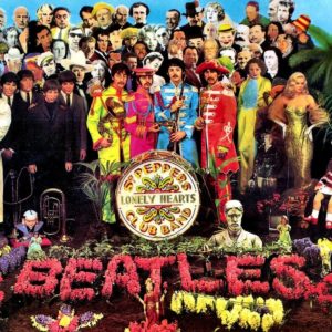
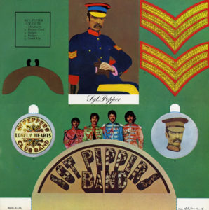
This is one of the rare exceptions where anything Beatles would rank so low on this list. The album cover is fascinating which is why it was in my Top 5 from the Top 40 list. The gimmick is simple and sadly is often missing or cut up if you buy this record used. If you are lucky to buy this record complete, you are gifted with little Sgt. Pepper cutouts including Sergeant patches, a couple of badges, a Beatles Sgt. Pepper’s Band stand-up, a picture card of Sgt. Pepper, and a mustache to allow you to join in on Sgt. Pepper’s band.
#23-Seven Separate Fools-Three Dog Night-1972
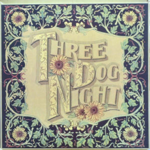
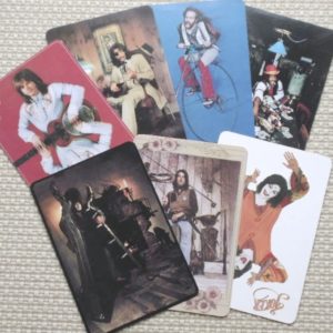
Similar to #24, here is another album that gives you fun accessories with the album. Also, just like the previous entry, these are often missing when bought used. The only reason why I knew about this is that my copy was complete. Three Dog Night’s 1972 album includes what appear to be giant playing cards, 7 in all, each nearly 12 inches tall.
#22-The Who By Numbers-The Who-1975
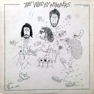
This one is another simple one and probably would’ve been at #24 had The Beatles and Three Dog Night albums have a gimmick both guaranteed to be with your purchase (if used I should say) but they are also gimmicks you won’t see right away (although that doesn’t come into play on some of the other items on this list). For The Who’s 1975 album, we are gifted with a fun “connect the dots” game that when completed, gives us complete cartoon versions of the four band members.
#21-Roxanne/I Can’t Stand Losing You_Message in a Bottle/Message in a Bottle (Live)-The Police (Picture Disc Single)-1979/1980
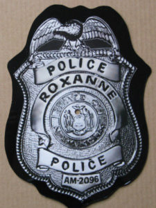
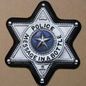
This one is a little harder to find than some of the others and I wasn’t sure if I wanted to include this one or not, but it was too interesting to not include. These are picture discs, meaning the album cover is on the disc itself, but the record has been die-cut into a unique shape. Both of these are cut into police badges. The amazing part is, despite the strange shape, they are fully functional records!
#20-Octopus-Gentle Giant-1972
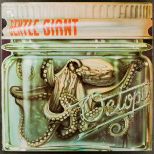
I have a few album covers on here that are a unique shape. This one is interesting. The black that you see around the jar is a result of the background interfering with the image and a background was likely retained for the CD release of the album. The vinyl version released in 1972 for the US and Canada features an album cover where the jar containing the octopus is die-cut to be the shape of the jar. This is one of many images on this list that will be die-cut in some way and they are all fascinating!
#19-Led Zeppelin III-Led Zeppelin-1970
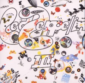
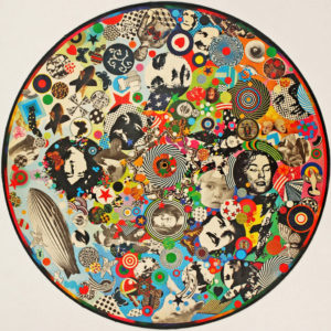
At first glance, this one looks like a standard, yet interesting, album cover. What makes this record stand out from other Zep album covers is the psychedelic wheel. There are small holes on the front cover and as you turn the wheel on the side of the record, the images change. A picture of the full psychedelic wheel is directly under the album cover. The wheel is colorful on its own but is included as a wheel to change up the image slightly on the front cover makes this a unique gimmick that I’ve never seen before.
#18-The Low Spark of High Heeled Boys/Shootout at the Fantasy Factory-Traffic-1971/1973

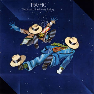
Both of these are the same shape so they are going to share this spot. The Low Spark of High Heeled Boys was released by Traffic in 1971 as their fourth studio album, and Shootout at the Fantasy Factory is their fifth album. Low Spark appears to be a two-dimensional cube with each face having a different pattern or image on it. Shootout appears to have two characters trapped in a two-dimensional cube. The black triangles are not present on the original vinyl and were only included on the CD image to make a complete square.
#17-Through the Past, Darkly (Big Hits Vol. 2)-The Rolling Stones-1969
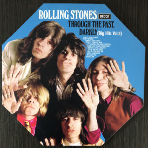
Another interesting shape is a Rolling Stones compilation album released in 1969. The album name is a play on a line from the King James Version translation of 1 Corinthians 13: “For now we see through a glass, darkly, but then face to face…” The package was packaged not only as a die-cut octagon but with a gatefold too. The album features an epitaph for founding member Brian Jones that reads, “With this you see, remember me and bear me in your mind. Let all the world say what they may, speak of me as you find.” Brian Jones drowned in his pool earlier that year.
#16-Side 3-The Raspberries-1973

Another interesting die-cut album cover, this time to a basket of raspberries, with the group’s name placed on top of the LP sleeve. This, in my opinion, is one of the more interesting die-cuts.
#15-Sticky Fingers-The Rolling Stones-1971
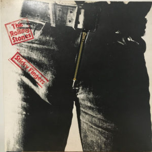
My second record for The Rolling Stones on this list. The album cover emphasizes the suggestive innuendo of the album title. The image shows a close-up of a male crotch. The vinyl release of the album features a working zipper and perforations around the belt buckle that opened up to reveal a sub-cover of cotton briefs. This cover was created by Andy Warhol and was photographed and designed by members of his art collective, The Factory, which was highly innovative in design. Because the zipper was known to cause damage to the record, later releases removed the zipper and just featured the outer photograph of the jeans.
#14-Catch a Fire-The Wailers-1973
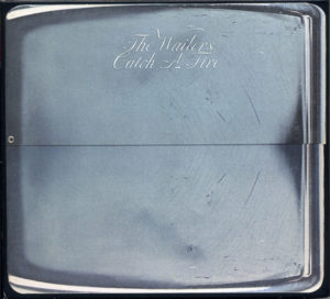
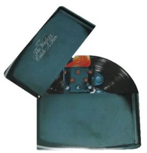
This was The Wailers’ fifth album released in 1973. The original version, designed by Rod Dyer, was had a hinged album sleeve where the top half pivoted to reveal the flame of the lighter as well as the record itself. Only 20,000 copies of the album had the zippo cover. Subsequent pressing os of the album had an alternate cover designed by John Bonis, and featured a painting of Bob Marley smoking a joint, with new credit to the album being “Bob Marley and the Wailers”. Copies of the original pressing are no surprise highly sought-after collector items.
#13-E Pluribus Funk-Grand Funk Railroad-1971
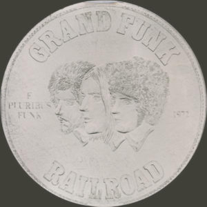
Speaking of fifth albums by bands, here is the fifth album by Grand Funk Railroad, released in 1971. The title is a play on the motto of the United States, E Pluribus Unum, which means “Out of Many, Funk” in Latin. The original cover designed by Ernie Cefalu features a completely round and covered with silver-like foil to resemble a large coin. Those who watch my Awesome Albums videos pay close attention to this album cover in the intro, it rolls instead of just sliding with the others.
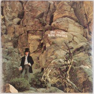
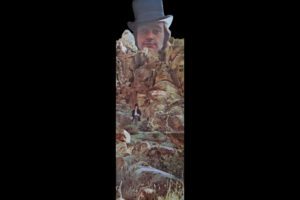
#12-Alone Together-Dave Mason-1970
This album is the debut solo album for former Traffic member, Dave Mason. The original record jacket is trifold with a half-pocket with a die-cut image of Mason in a top hat, collaged behind a rocky outcrop. There is also a small die-cut hole at the top to permit the jacket to be hung on the wall as a poster.
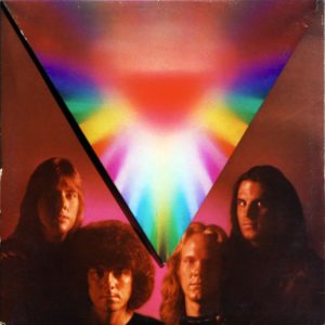
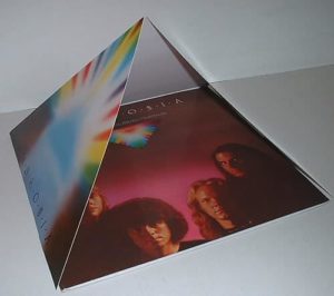
#11-Somewhere I’ve Never Traveled-Ambrosia-1976
Ambrosia’s second album was released in 1976, their final album with 20th Century Fox Records. The first pressings of this album featured a custom “pyramid” cover which had 3 fold-out panels that turn the cover into a three-dimensional pyramid.
#10-Hard Labor-Three Dog Night-1974
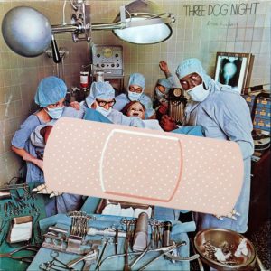


Original pressings of Three Dog Night’s eleventh album features the “birth” of the record. It was deemed too controversial and was first included with a manila file covering up most of the album. This was later reworked with a huge Band-Aid covering the “birth”. The manila file shows all the details for our bouncing baby record.
#9-Thick as a Brick-1972
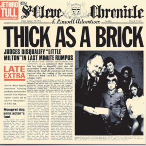
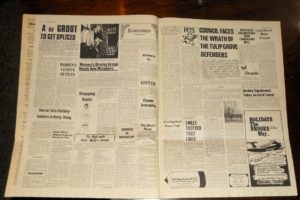
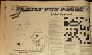
While Jethro Tull’s Thick as a Brick is an interesting enough album cover on its own, it’s the extra gimmick stuff that makes it far more fascinating. First, the newspaper design continues onto the back and the gatefold but the original pressings of the gatefold have an extra few inches that fold down giving us a full-sized newspaper to read while we enjoy the record. There are multiple pages even including a family fun section with “connect the dots” and a crossword puzzle.
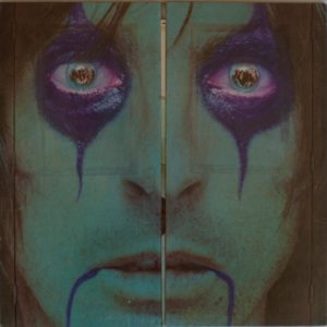
#8-School’s Out-Alice Cooper-1972
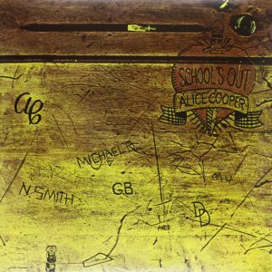
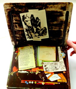
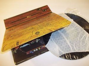
School’s Out is one of Alice Cooper’s best-known songs and that gives a lot of appeal to this album already. The album cover is interesting depicting an old school desk that has been vandalized with doodles and names carved into it. What makes this album stand out is the way the album opens. Instead of opening to the side to depict the gatefold, it opens up as if you were sitting at an old school desk. The gatefold includes a photograph of the band, as well as pencils, a comic book, and notebooks. They go a step further with this album cover which includes a pair of paper panties on the record itself as well as die-cut legs that fold down to give the illusion of a very small and short desk. This isn’t the only Alice Cooper to go above and beyond but we’ll come back to that in a little bit.
#7-Chickenfoot-Chickenfoot-2009

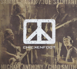
The album cover itself doesn’t look all that special. It’s just a black album cover with Chickenfoot’s logo. What makes this album cover shine is the first pressing version of the album was packaged with “heat sensitive” artwork that revealed an image of the band when touch or exposed to heat above 84 degrees Fahrenheit (or 28.89 Celsius).
#6-Some Girls-The Rolling Stones-1978
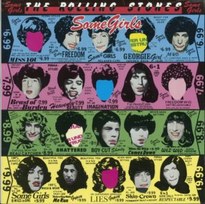
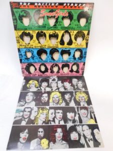
We return to The Rolling Stones, an album cover designed by Peter Corriston with illustrations by Hubert Kretzschmar. The album cover features a die-cut design, featuring Rolling Stones’ faces alongside those of select female celebrities. You can slide the faces across to give The Stones a new hairdo. The cover design was challenged legally when Lucille Ball, Farrah Fawcett, Liza Minelli (representing her mother Judy Garland), Raquel Welch, and the estate of Marilyn Monroe threatened to sue for the use of their likeness without permission. The album was quickly re-issued with a redesigned cover that removed celebrities, whether they had complained or not. The celebrity images were replaced with black and punk style garish colors with the phrase “Pardon our appearance-cover under-reconstruction”. Lead singer Mick Jagger apologized to Minnelli when he encountered her during a party.
#5-Black Moses-Isaac Hayes-1971
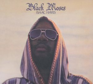

The fifth album by soul musician Isaac Hayes is a double album released on Stax Records’ Enterprise label in 1971. The album’s title derives from Stax Executive Dino Woodward’s nickname for Hayes, which he gave him after comparing the effects of his music on black audiences to the leadership of the biblical Moses. The then deeply Christian Hayes said the nickname was sacrilegious, although a journalist popularized the nickname in an article he wrote on Hayes for Jet magazine. Hayes then came to see “Black Moses” as a symbol of black pride. He devised, with the assistance of Bar-Kays member Ron Gordon, a gatefold cover design that unfolded into a poster-sized image of Hayes, dressed in biblical-inspired clothing as “Black Moses”.
#4-From the Inside-Alice Cooper-1978
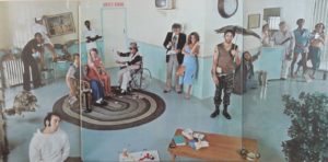
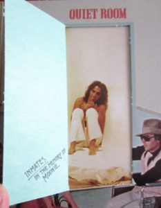

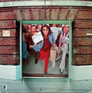
We come back to Alice Cooper for this interesting album cover. The front album cover features a close-up of Alice’s face. The album opens up like a set of double doors to reveal the inside of a mental hospital. The album was inspired by Cooper’s stay in New York’s asylum due to his alcoholism. Each of the characters in the songs were based on actual people he met in the asylum. If we look closely at the door that says “Quiet Room” we find we can open that door to find Alice sitting in the quiet room with a note on the door that says “Inmates! In the memory of Moonie”. This is a nod to Cooper’s old drinking buddy, Keith Moon, drummer for The Who. Moon died a little over two months before the release of Cooper’s album. Flip over the album, the back cover shows a set of double doors with the track listing. The doors open to show all the inmates stampeding out the corridor, waving papers in the air stating their release.
#3-Shinin’ On-Grand Funk Railroad-1974\
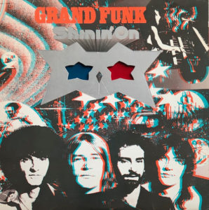
Grand Funk’s eighth album was released in 1974. While it wasn’t as successful as their previous album, We’re an American Band, its first single was a cover of “The Loco-Motion” which topped the US charts. The original cover was done in bi-visual 3D. Those stars that you see in the image are 3D glasses that you can pop out to enjoy a 3D image on the front, back, and gatefold of this album giving a unique experience. This album cover was one of my leading inspirations for creating the Awesome Albums series.
#2-Stand Up-Jethro Tull-1969
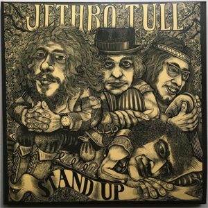
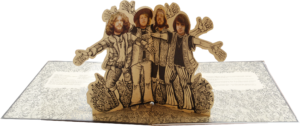
Jethro Tull had a very interesting second album. The album was good but the main focus that I want to talk about today is in the album’s gatefold. Under the direction of Terry Ellis, the band met a woodcarver named James Grashow who followed them for a week to properly represent them in wood. The result gatefold, in a woodcut style designed by Grashow, opened like a children’s pop-up book so that a cut-out of the band’s personnel stood up which then gave the album’s name, Stand Up. The pop-up was not carried over to the 1973 album reissue.
#1-Ooh La La-The Faces-1973
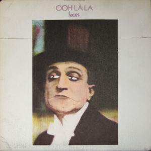
This is the Faces’ fourth and final studio album released in 1973. The cover was designed around a stylized photograph of “Gastone”, a stage character of 1920s Italian comedian Ettore Petrolini. The original cover was constructed in a way that the top edge of the sleeve was pressed down, a concealed die-cut design element made Gastone’s eyes appear to discolor and move from side to side, and his mouth would open.
I’m sure there are plenty of album gimmicks that I didn’t cover, but I covered the ones I knew about. What about you? What gimmicks did I forget about? What gimmicks would you put on your list? Share your thoughts in the comments below. Before you go, don’t forget to follow Awesome Albums on Instagram and Twitter, like on Facebook, and Subscribe on both YouTube and BitChute for music-related content. Also, don’t forget to come back soon for another list for Top “Ten” Tuesday!
Leave a Reply
You must be logged in to post a comment.